M.C.Escher's Legacy. A Centennial Celebration
Selection is Distortion
The first time I visited Escher in his studio in Baarn he was finishing the drawing for Print Gallery. This was in 1956. I remarked that I did not like the drawing because of the ugly cross that filled the upper left side of the drawing. When I got home, I wrote him suggesting that he might be able to camouflage the cross by letting a clematis climb on it. Just imagine how cheeky that was! Escher was almost sixty, had more than earned his stripes as a graphic artist, and already enjoyed considerable recognition as the creator of very unusual prints. I was thirty and a teacher of mathematics. He wrote me a letter explaining why it was impossible for a clematis to climb on a window frame, and then went on to say that his prints were not meant to create something beautiful, but to evoke a sense of wonder in the viewers.
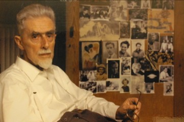
His reaction was eloquent because it shows how seriously he took the criticism of a young man who hardly knew his work. In a long letter to his son Arthur about my visit, he had not even one word of condemnation of my behavior. He wrote, "He was much interested in my jokes on perspective, and especially in my inversion print Convex and Concave ... as well in my regular divisions of the plane." (See [2, pp. 86-87] for a long exerpt from this letter.) Later when I had learned more about Escher's work I realized how stupid my first reaction to his Print Gallery had been; now I am convinced that this print is by far one of Escher's greatest achievements.
For a long time my greatest admiration went to Escher's prints with a strange and sometimes impossible architecture and I wrote articles about them in several periodicals. His regular divisions of the plane encouraged me to study this matter in crystallographic publications and I was impressed when I saw how he had worked out this material very systematically in his own way in several workbooks before and during World War II. So strange architectures and regular divisions of the plane were for a long time, for me, the most attractive subjects of Escher's work.
Is it not strange that these two themes most attract people's interest in Escher, so that most of Escher's prints made before 1938 are rather unknown? And also that interest in his later works is limited to fifteen to twenty prints, mainly represented by regular divisions of surfaces and by impossible figures? This has created the image of an Escher who drew divisions of surfaces with lizards, birds, and fishes which miraculously change into other figures, and of an Escher who invented impossible, nonexistent buildings and depicted all sorts of optical illusions. This image is not only one-sided, but also incorrect. It is a distortion which does not do Escher's oeuvre justice; it ignores what Escher wanted to convey through his prints.
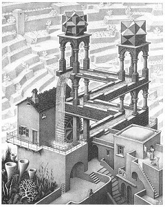
Although Escher is identified with impossible figures, he made only three prints which feature impossible figures - Waterfall, Belvedere and Ascending and Descending - all within the short period from 1958 to 1961 (Fig. 1). Belvedere was based on the impossible cuboid, which he invented himself. The impossible figure on which Waterfall was based he borrowed from Penrose and the structure in Ascending and Descending was also based on an idea of Penrose. We should add that in this latter print, the way in which Escher worked it out resulted in a curious architecture indeed, yet the underlying construction is not impossible. Impossible figures were first discovered in 1934 by the Swedish artist and art historian Oscar Reutersvärd. But the public was not ready to appreciate such images and moreover Reutersvärd gave his inventions in abstract form, not in prints that suggested a real world.
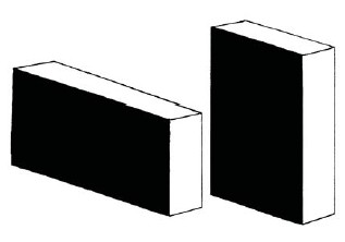
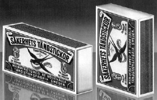
It is also a misconception that Escher depicted optical illusions. Of course, Escher knew many optical illusions; he was interested in them and enjoyed them as well. Yet he never chose them as a starting point for a print. I will give one example here. In Fig. 2 you see two boxes. Our visual perception tells us that the left one is more elongated than the right. But if you take a piece of paper and cut it so that it exactly covers the black side of the right box you will discover that the same piece of paper also exactly covers the black side of the left box. I asked a friend (Fred van Houten, who has made many impossible figures) to dress up the two boxes so they would appear more realistic. The result of his computer work is reproduced in Fig. 3. Escher undoubtedly would have added this picture to his beloved collection of prints displayed on the door of his cupboard, but he would never have been tempted to make something like this himself. He was occupied with very different things. Dressing up optical illusions was entirely outside of his scope.
Intention and Perception
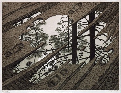
There will be always a discrepancy between the intention of an artist and the impression and ideas that enter the mind of a spectator confronted with a work of art. In the case of Escher, this discrepancy (or difference) can be large. I will illustrate this with the print Puddle (Fig. 4). Most people find this an attractive print. As for composition and mood, it is an attractive print. But the muddy ground, with its small pool of water and tracks made by cars, bicycles, and shoes, is nothing more than the representation of an idea, as are the sky, the trees and the sun, reflected in the pool. What Escher meant to express was the possibility of our perception and the ability to depict different worlds on the same piece of paper. One could even say, although Escher never hinted at this, that the time dimension also makes its presence felt in the print: the tracks in the mud are relics of events which took place in the past. In short, Escher intended to illustrate the remarkable fact that drawing makes it possible to show two different worlds at the same time in the same place. But most of the spectators have another perception and idea: even a puddle on a path along the fringe of a wood is beautiful.
Selection by the Public
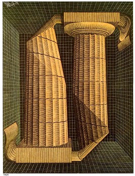
The work of Escher is immensely popular. But as I pointed out earlier, this holds only for a limited group of his prints. Three of his little-appreciated prints are Doric columns (1945), Three Spheres (1945), and Dragon (1951). All three express the same fact of two-dimensional representation: while depicting threedimensional forms from our surroundings or our fantasy, the beholder is actually deceived, because there is no third dimension - everything is flat. In Doric columns, Escher first drew two columns twice as long as what you see in the print (Fig. 5). Then he made incisions to trim three-quarters of the columns, folded these parts and made a new drawing of the whole. For most people the result is an enigma. But the message is clear: drawing is an illusion. Or, if one wishes to put it more strongly: depicting is deceit.
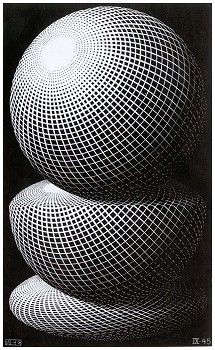
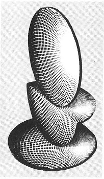
In Three Spheres the upper sphere is not a sphere at all, but is a flat drawing with circles and ellipses (Fig. 6). Yet our visual system converts the image into a three-dimensional sphere. The middle figure is converted by the viewer into an egg, but Escher has actually drawn the same figure as above it, but now folded. Finally, at the bottom of the print, the same figure is laid flat to make clear the same message: I draw flat figures but you see three-dimensional objects. (See Fig. 7.) And this is so common that it does not surprise us. But it did surprise Escher and with these drawings he wished to transmit his wonder to the spectator. In Dragon, those who do not focus on the incision in the belly of the dragon (and its consequences) miss the point that the dragon is simply a figure in black and white on a flat surface.
Selection by the public is, of course, only natural. No one can be forced to like a print or to find it interesting. It is important, though, to point out that such a selection - especially in the case of Escher - gives a false impression of his oeuvre. What he wanted to express thereby suffers from distortion. Those who really want to get to know Escher and his work will have to consider his whole oeuvre and his oeuvre as a whole.
Escher's Intentions
Then what was the intention of Escher and the essence of his work? Before 1937 there was no particular path that Escher followed. It was a period in which he absorbed many impressions and fixed them in sketches, woodcuts, and lithographs. In the approximately 110 prints he made from 1937 onwards, we see a report of a voyage of discovery. Each print can be seen as a page from the 'logbook' he kept up to date during this voyage. What did Escher want to discover?
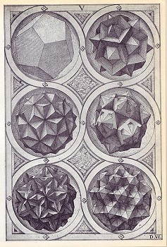
The first to see Escher's work in the right perspective was his French kindred spirit and life-long penfriend, Albert Flocon, professor at the École des Beaux Arts in Paris. He had a wide range of interests, but his main work was on perspective. He was the father of curvilinear perspective, with which he could draw scenes with a 180° view [4]. In 1965 he wrote a long article about Escher's work in the art magazine Jardin des Arts and he classified Escher among the "thinking artists", also naming Piero della Francesca, DaVinci, Dürer, Jamnitzer, Bosse-Desargues, and Père Nicon. For these artists, the art of seeing and the representation of what is seen are linked with fundamental research in this field [5]. Figure 8 shows a page from a publication by Jamnitzer which was in Escher's possession [6]. It is a woodcut of polyhedra drawn by Jamnitzer in correct perspective - a product of science and art. It is also clearly the work of a "thinking artist" as Albert Flocon had in mind when he typified Escher as such.
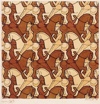
Escher was a scientist in his research and an artist in depicting his findings. For Escher, everything revolved around research into the nature of his job: depicting. In doing so he stumbled upon questions like: which possibilities does a flat surface offer if we want to fill it entirely with congruent figures? How he struggled with this problem and the victories he achieved are described in detail in Visions of Symmetry, written by Doris Schattschneider [8]. We reproduce in Fig. 9 one of his most attractive and ingenious examples. It is one of the few regular divisions he also used for a print - the color wood engraving Horseman (1946) in which a topologically interesting band is rendered. Escher also used his regular divisions in his attempts to visualize the concept of infinity. Circle Limit III (1959) is perhaps his most perfect expression of infinity (see color plate 4).
Escher was intrigued not only by the limited possibilities of depicting a threedimensional world on a two-dimensional surface, but also by the many extra possibilities of expression which are not available to a sculptor who works threedimensionally. Exploration of those many possibliities was the source of his most famous prints: the strange architecture found in Balcony (1945), Other World (1947), Up and Down (1947), House of Stairs (1951), Relativity (1953), Convex and Concave (1955), Print Gallery (1956), and the three prints discussed earlier, Belvedere (1958), Ascending and Descending (1961), and Waterfall (1961). Here we find Escher's interface with optical illusions, not as a collection of remarkable peculiarities of visual perception as seen in textbooks, but as the predominant optical illusion: flat pictures are converted by our visual system into three-dimensional objects even though these objects do not exist or cannot exist in our real world.We do not notice nor experience it as something extraordinary that flat pictures are seen as three-dimensional objects, but Escher reminds us with his prints how extraordinary this phenomenon is, and the incredible results to which this can lead.
Only the Most Perfect Expression
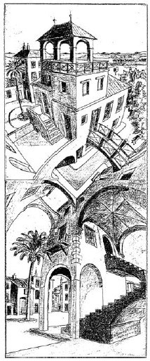
It is remarkable, but entirely in agreement with the nature of Escher's prints as the reflection of his research, that he never repeats himself. He was not much interested in making beautiful pictures, but in depicting newly-found ideas. Therefore he frequently called his prints illustrations of thoughts. Such an idea would sometimes keep him busy for many months and he made a large number of preliminary studies to work out the final presentation in a print. These studies are often so interesting that they could easily be used as the basis for a good print. For example, Fig. 10 shows one of his last preliminary studies of Up and Down; I completed this sketch myself. Of course this sketch is not an Escher print. He did not use this attempt to express his idea. He wanted a print that showed the most perfect expression of his idea and he did not find it worthwhile to make a print of what might be a nice subject in itself. After completing a print (which he always found disappointing), he went on with new ideas that often arose during the peace and quiet of carving a woodblock for printing or copying his drawing onto litho stone.
Mapping Escher's Oeuvre
In 1968 I tried for the first time to map Escher's oeuvre in a chart. One wall of my study was covered with reproductions and photos of his prints in chronological order. Making up an inventory gave me insight as to how Escher's interest advanced in time. When I discussed this with Escher for the first time, he laughed about it. But after some time he agreed with my analysis, which you can find in in chapter 5 of The Magic Mirror of M.C. Escher [3]. There I discuss the systematic development of Escher's work and the intentions of his prints. In this article, I can give only a glimpse of what is contained in that discussion.
A New-Found Category of Prints
I would like to take this opportunity to mention a theme from Escher's work which does not appear in my survey of his oeuvre. I had always overlooked it and never discussed it with Escher. He once confided to me "I absolutely cannot draw. Even for the more abstract things like knots and Möbius bands, I first make paper models which I then copy as precisely as possible. It is much easier for sculptors: everyone can mold. I have no problem with molding, but I do with drawing. I find it terribly difficult; I cannot do it well. Drawing is indeed much harder, much more intangible, but you can suggest much more with it."
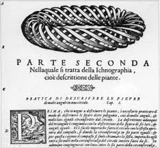
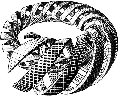
Of course his lament "I cannot draw" is an exaggeration. What Escher meant was that he lacked the gift of many artists who can effortlessly draw various scenes embellished with humans and animals, without a model. There is a series of prints for which he expressly picked the hardest subjects that make real challenges for an artist. He liked to solve difficult depicting problems in a satisfying way. The fact that I missed this obsession of Escher is strange, for Escher had given me a clear hint when he discussed his print Spirals with me. It was difficult for me to decide the place of this print in his oeuvre. Escher told me that he made this print after he had seen a torus made up of spiraling bands in a book about perspective by Daniel Barbaro [1] (Fig. 11). It was intriguing that you could see the inside of the torus, but it annoyed Escher that it was not very well drawn. And so he set himself to do it not only better, but he also made the goal more difficult: he would not depict a simple torus with spiraling bands, but a body that would become thinner and thinner and would keep spiraling back into itself. He made many preparatory studies [7, pp. 166-167] that show how he was a master in making unusual perspectival constructions. And the result was a beautiful color wood engraving (Fig. 12). But it was not popular, for Escher sold only three or four prints, and as far as I know he printed only ten.
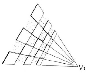
Escher's fascination with difficult construction problems by which he could illuminate the invisible parts of three-dimensional objects can also be seen in Two Intersecting Planes (1952), Concentric Rinds (1953), Three Intersecting Planes (1954), Sphere Spirals (1958), Four Regular Solids (1961), and Knots (1965). These prints are not his most appreciated. In fact, one is considered to be so untypical "Escher" that the only reproduction you can find is in the full catalog of his work [2] . I think that only a few people have given any attention to this print: Three Intersecting Planes (Fig. 13). However, I will show you that this print is intriguing and a really "typical" Escher print. There are three planes - white, green, and black - which are perpendicular to each other. In Fig. 14 I drew only the white one. The intersection point of the three planes is at the center of the print. Easy to draw, but not if you want to show the hidden parts of the planes. So Escher tried to open up each plane so that you can see the other planes through the holes. Each plane is like a chessboard with only the white squares, where the black ones have been cut out. The plane converges to infinity at the vanishing point V1. The three vertices of the triangle (that depict the vertices of a tetrahedron) are vanishing points of the three planes.
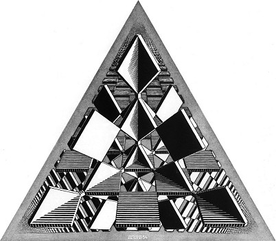
Perhaps you are not impressed by the result of Escher-s effort in this print; nevertheless, such unappreciated prints, perhaps even more than the most appealing ones, show Escher's imaginative ways to help us see the ideas he imagines.
References
- Daniele Barbaro, La Practica della Perspectiva, Venice, 1568-69.
- F.H. Bool, J.R. Kist, J.L. Locher, F. Wierda, eds., M.C. Escher, His Life and Complete Graphic Work, Harry Abrams, New York, 1982.
- Bruno Ernst, The Magic Mirror of M.C. Escher, Ballantine Books, New York , 1976. Reprint Taschen-America, 1994.
- Albert Flocon and Andre Barre, Curvilinear Perspective, University of California Press, Los Angeles, 1986.
- Albert Flocon, "À la frontière de l'art graphique et des mathématiques: Maurits Cornelis Escher", Jardin des Arts 131 (1965) 9-17.
- Wentzel Jamnitzer, Perspectiva Corporum Regularium, 1568.
- J.L. Locher, ed., The Magic of M.C. Escher, Harry Abrams, New York, 2000.
- Doris Schattschneider, Visions of Symmetry: Notebooks, Periodic Drawings, and Related Work of M.C. Escher., W.H. Freeman and Company, New York, 1990.
